
THERAPY WITH KOSTA
Brand Identity · Logo Design · Web Design · Photography

A complete brand launch for a Kansas City movement therapist stepping out on her own for the first time — built around the idea of fluidity, embodiment, and the kind of healing that lives in the body, not just the mind.


DELIVERABLES
Kosta had spent years practicing under a group, developing a deeply personal approach to therapy rooted in movement, attachment, and embodied healing. When she was ready to launch her own practice, she needed a brand that could hold the weight of that work — poetic without being vague, calming without being cold.
The brief was clear: light, fluid, in motion. Movement therapy asks clients to trust their bodies, so the brand had to feel like an invitation rather than a clinical front door.
The logo uses carefully weighted letterforms with a lowercase "with" nestled between THERAPY and KOSTA — a small typographic choice that carries a lot of relational meaning. The alternate icon takes it further: flowing parallel lines that suggest water, breath, a body moving through space. Abstract enough to be versatile, specific enough to mean something.
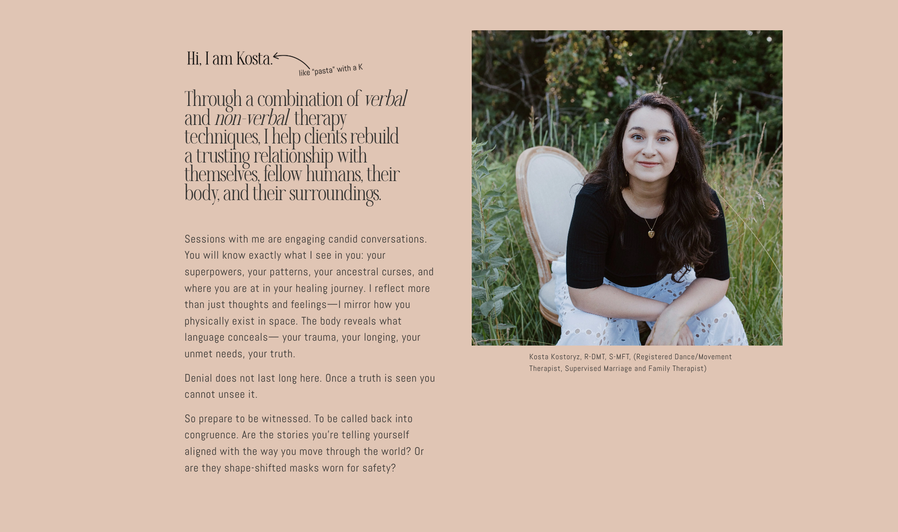
The color palette — deep teal, olive gold, blush, and cream — avoids every therapist cliché in the book and lands somewhere that feels grounded, warm, and quietly confident. I extended the brand into the full website build and Kosta's headshot, so the visual world holds together from first impression through every page.
Brand system — logo, alternate icon, color palette, and typography
Logo design · Alternate icon · Color palette · Typography system · Website design & build · Brand photography / headshot
Live at therapywithkosta.com
This is what it looks like when a brand is built around how someone actually works — not just what they do, but how it feels to be in the room with them.