
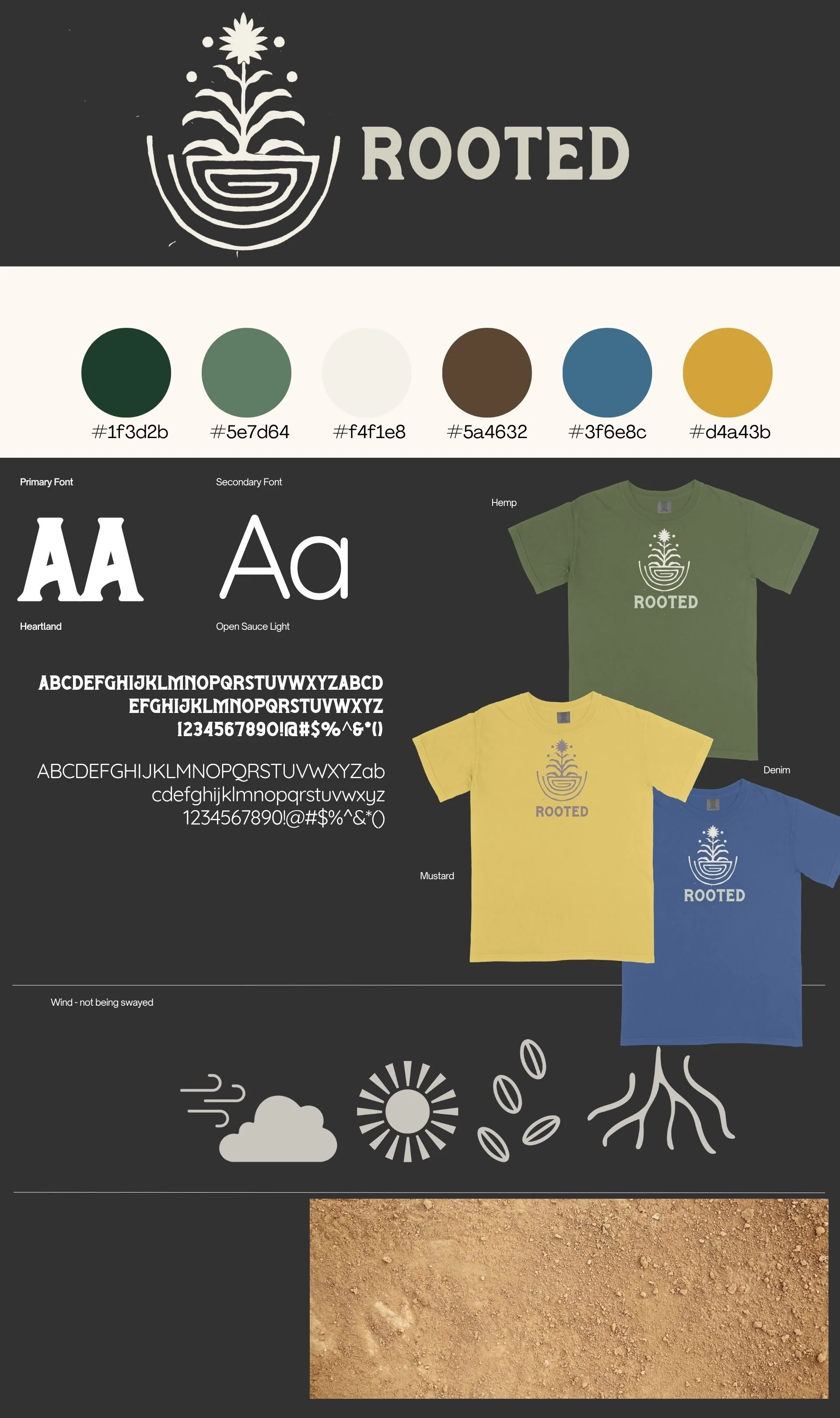
Brand identity design for Rooted, a summer camp program for high schoolers. The nature-inspired logo, earthy color palette, and apparel mockups reflect themes of growth, groundedness, and connection to the land.

Conversation card deck designed to spark meaningful neighbor-to-neighbor dialogue. The bold blue speech-bubble branding and illustrated character pairings make the cards approachable and inviting for community connection.

Logo, book cover, and ad design for One Vision, a Bible reading and discipleship resource including an app, book, and reading plan. Designs span digital and print formats to create a cohesive campaign.

Album artwork for Abide, a single by GC Collaborative. Part of an ongoing design relationship producing artwork multiple times a year, this piece features soft pink clouds against a blue sky for a serene, worshipful feel.
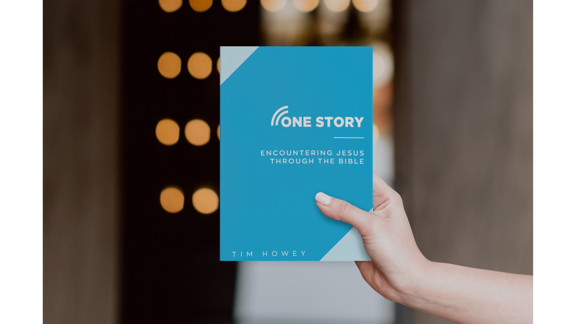
Book cover design for One Story: Encountering Jesus Through the Bible by Tim Howey, part of an ongoing series of covers designed for the author. Clean blue design with bold typography reflects the book's straightforward, accessible approach to scripture.
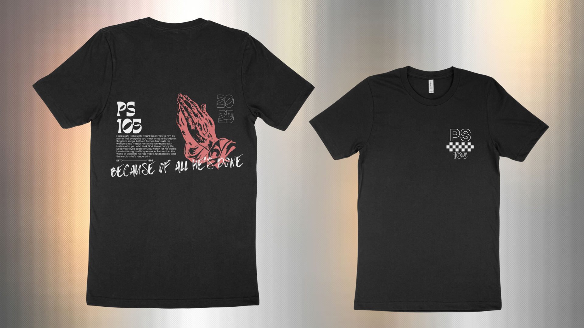
T-shirt design for a Psalm 103 worship night. The front features praying hands illustration and the phrase "Because It All He Deserves" in a bold graphic style. The shirts sold out and required a second order.
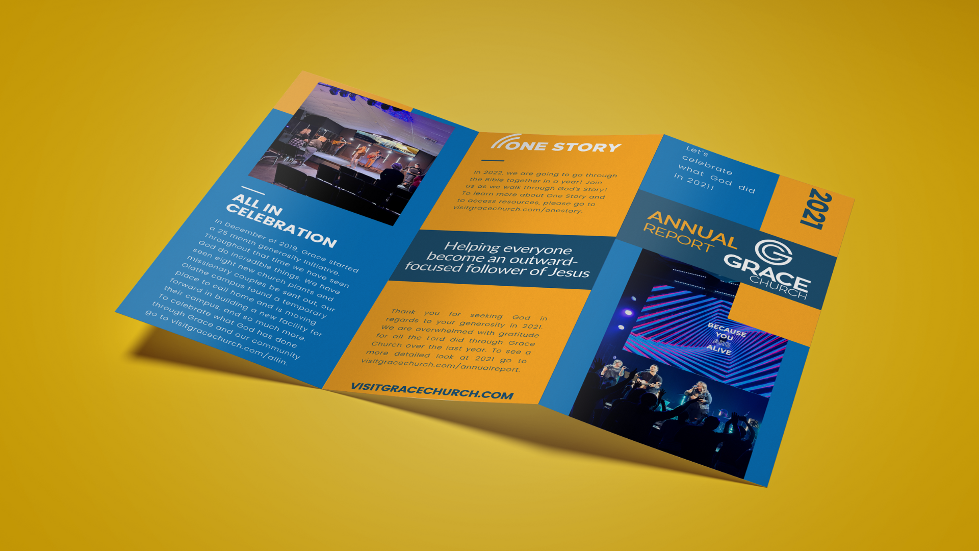
Annual report design for Grace Church, distributed to over 3,000 households. A recurring project spanning six years, the trifold layout balances bold typography, vibrant blue and gold branding, and compelling photography to communicate the church's vision and year-in-review.
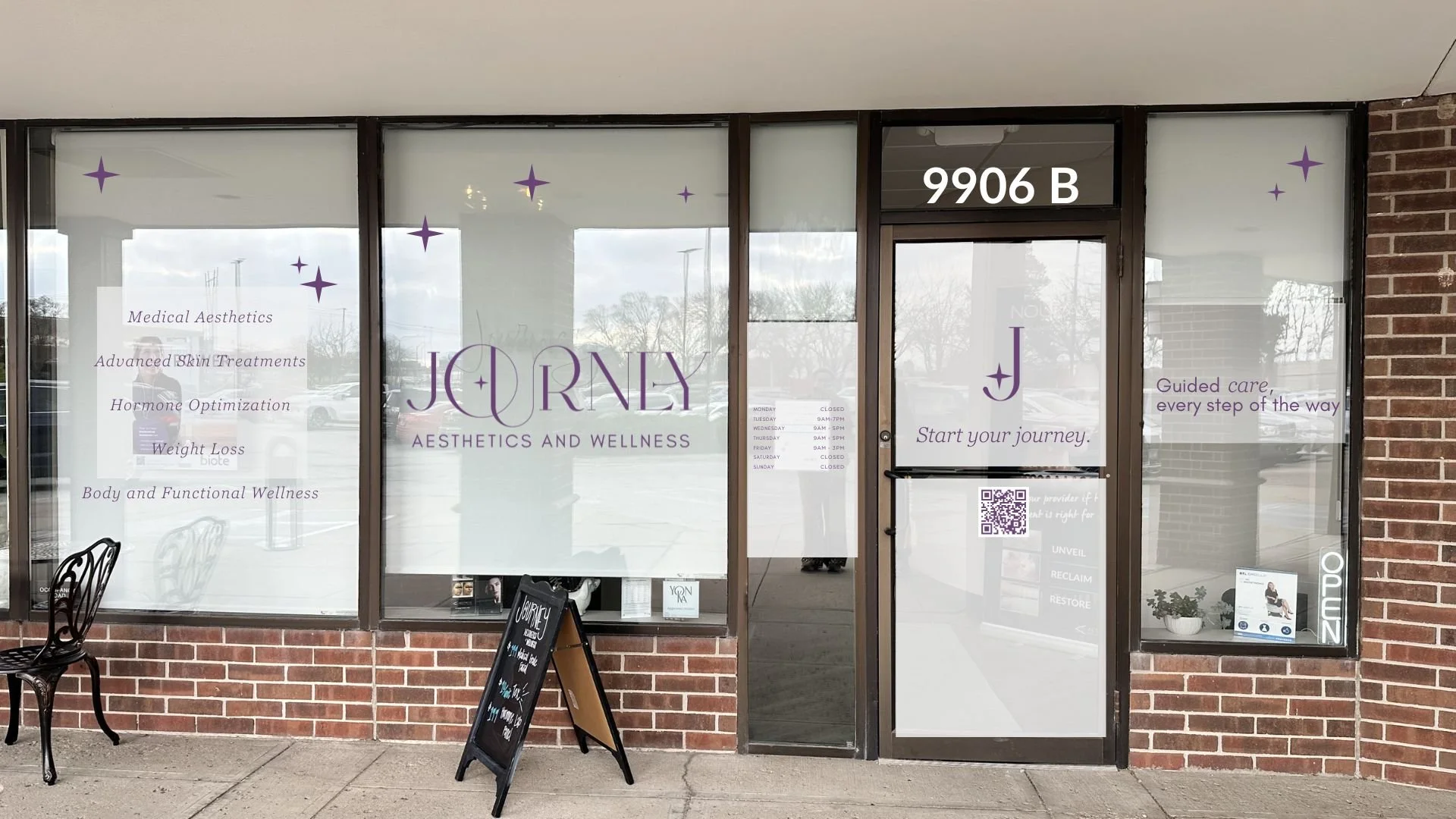
Storefront vinyl design for Journey Aesthetics and Wellness — designed, cut, and installed independently. The elegant purple branding and decorative star details translate seamlessly from screen to real-world signage.
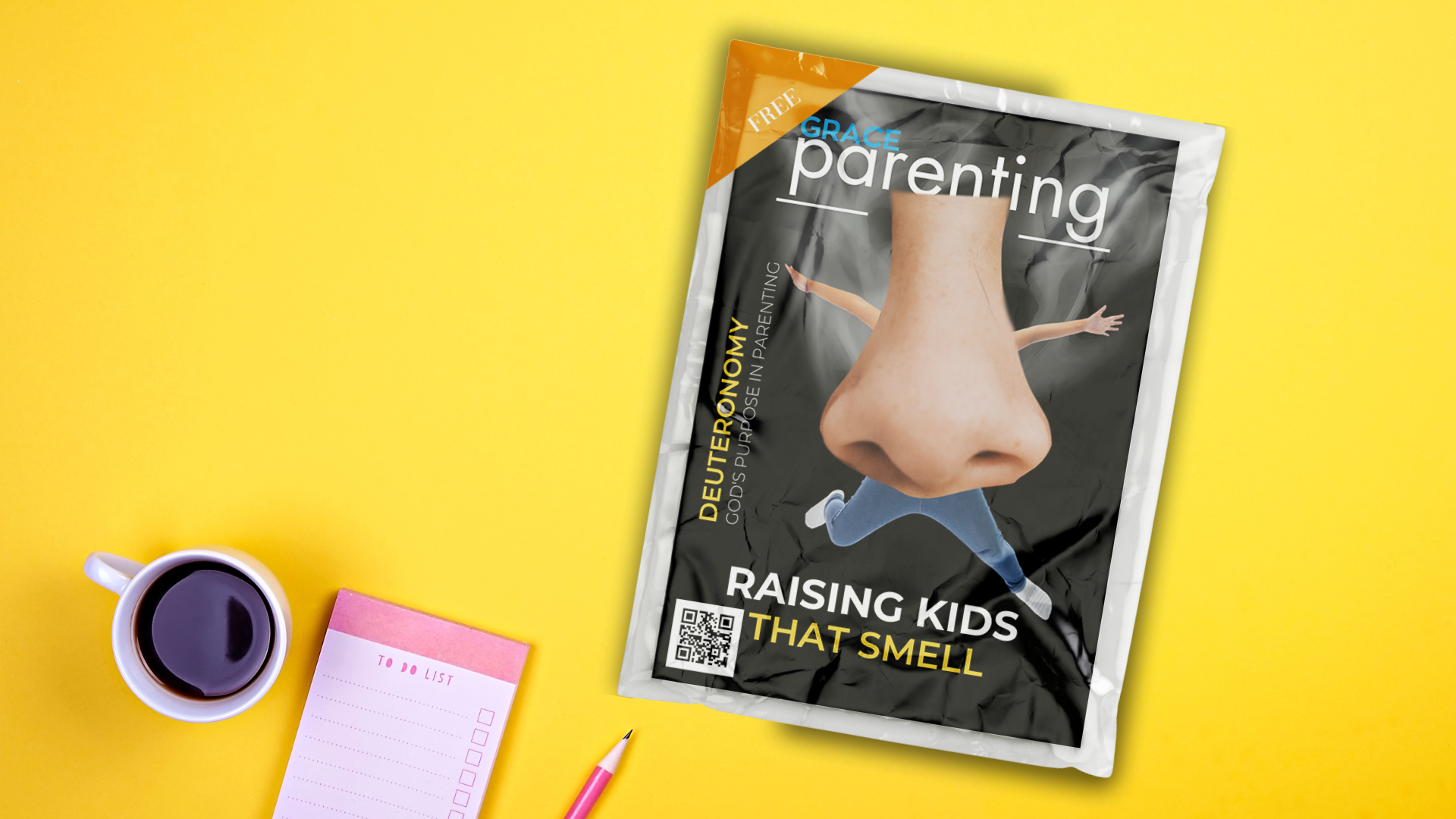
Promotional series graphic for Raising Kids That Smell, an adult teaching series based on Deuteronomy. One of roughly ten series graphics designed per year, this piece involved shooting original photography, compositing a mock magazine cover, adding a cellophane wrapper mockup, and placing it into a full desktop scene — multiple layers of production in a single deliverable.

Brand identity for Kaleo, a summer camp, featuring a bold custom logo, bright retro-inspired color palette, and iconography representing the camp's four core values: Sitting with Jesus, Surrendering to Jesus, Learning about Jesus, and Go.

Series graphic for Shipped, a student ministry series. As the sole designer for all graphics, apparel, and slides, this vibrant 3D-rendered scene captures the bold, energetic aesthetic created for the student audience.